Red Mask
To build the world of an independent feature, Ritesh Films commissioned the one-sheets of a horror franchise that never was: 13 films over 25 years, each poster true to its year.
- Client
- Ritesh Films
- Year
- 2025
- Work
- 13 posters, 1982 to 2007
- Role
- Poster designer
- Poster design and period research
- Dalton Corr, Opmet Osserpse
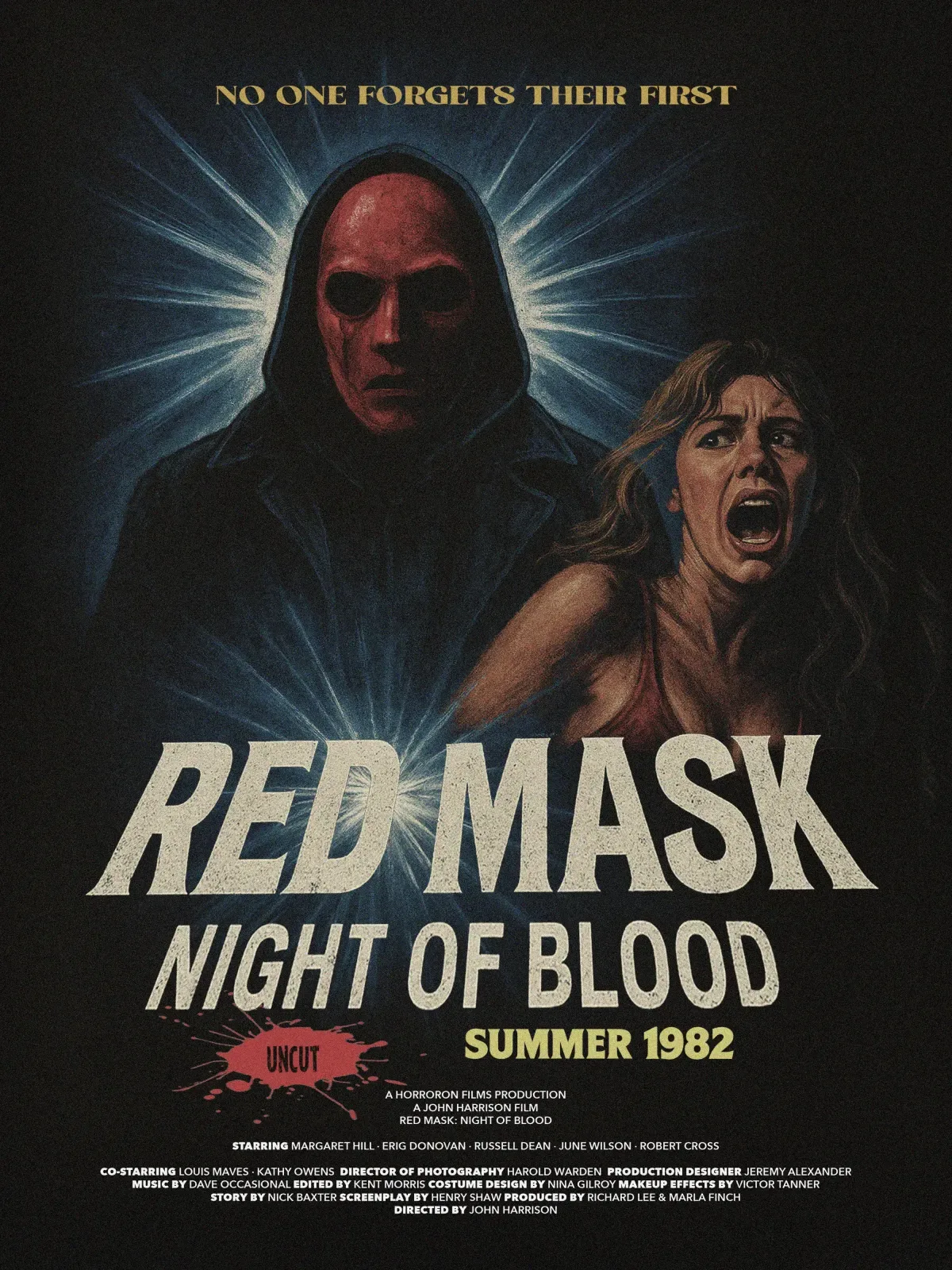
Red Mask: Night of Blood, 1982Art: Airbrushed, in a muted palette of navy, brick red and skin tones, faded and grainy like a worn one-sheet. The hooded figure lit from behind echoes Drew Struzan’s poster for “The Thing.”Type: A heavy condensed italic title, distressed; the tagline in gold flared capitals; a release season, “Summer 1982,” instead of a date.Fine print: A full credit block, bold roles beside light names.Period: Dark, illustrated and gritty, heavy on shadow and hand-drawn art.Studied: “Poltergeist,” “The Thing,” “Creepshow,” “Basket Case” and “Friday the 13th Part III.”
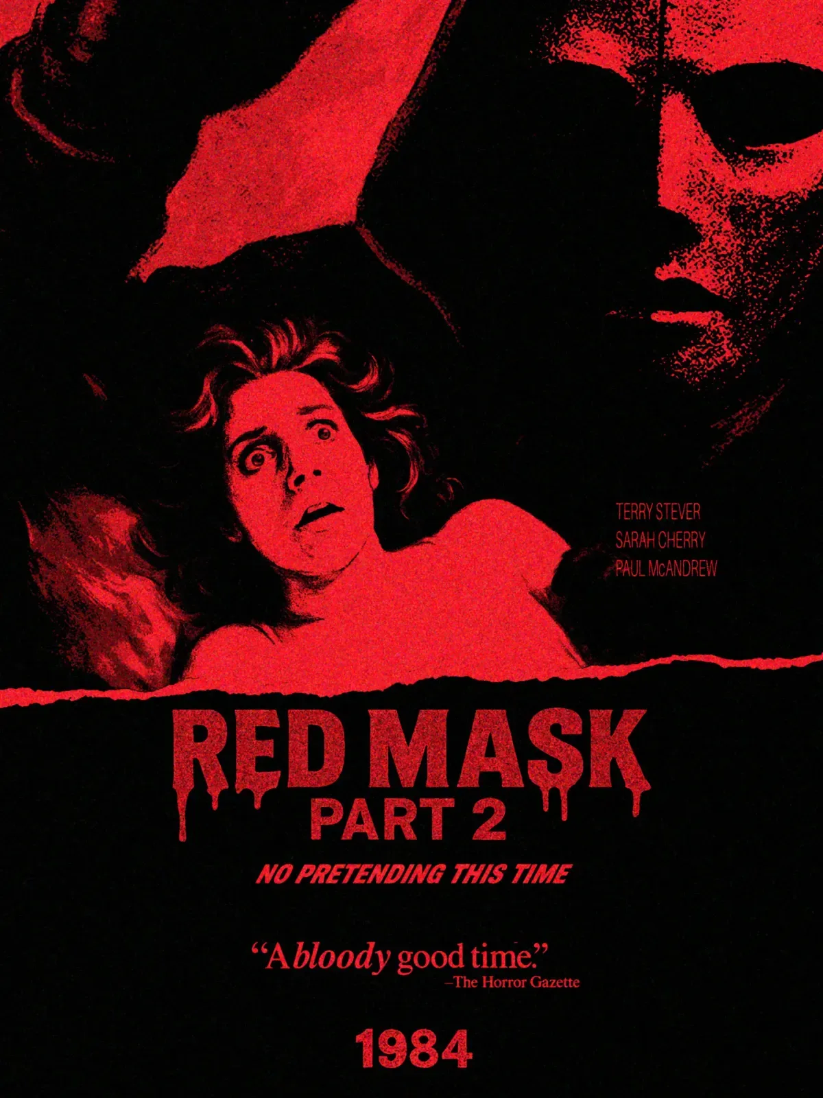
Red Mask Part 2, 1984Art: One ink, red on black, with a coarse grain like a cheap screen print. The mask looms over a girl in bed, the setup of “A Nightmare on Elm Street” that year.Type: A torn-paper edge above a dripping title; a bold italic tagline; a critic’s quote in serif, “A bloody good time”; “1984” set large at the foot.Period: Bold type and one striking central image that tells the story.Studied: “A Nightmare on Elm Street,” “Children of the Corn,” “Gremlins,” “Silent Night, Deadly Night” and “Firestarter.”
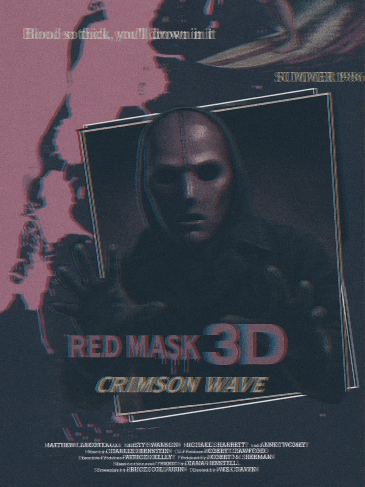
Red Mask 3D: Crimson Wave, 1986Art: Dusty pink and charcoal, every edge doubled in red and cyan as if printed for 3-D glasses. The killer reaches out past a tilted frame, the classic 3-D pose.Type: “3D” set larger than the title; “Crimson Wave” in italic sans; a serif tagline and “Summer 1986.”Period: Surreal and exaggerated, like “The Fly” and “Night of the Creeps.” Third entries went 3-D in the ’80s: “Friday the 13th Part III,” “Jaws 3-D,” “Amityville 3-D.”Studied: “Aliens,” “The Fly,” “Night of the Creeps,” “Poltergeist II” and “Critters.”
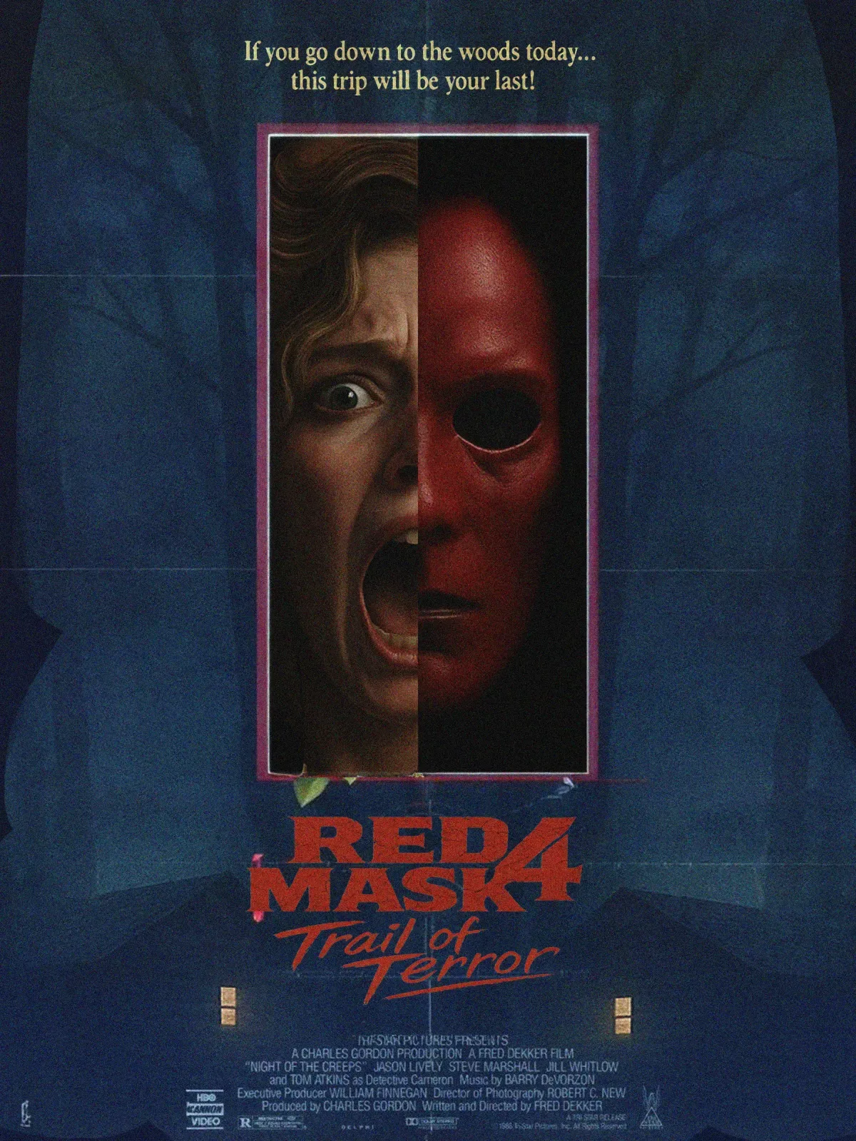
Red Mask 4: Trail of Terror, 1988Art: Airbrushed realism on a deep blue field of trees and two lit cabin windows; one framed panel splits a screaming face from the mask.Type: A stacked red title with a large “4” and a brush-script subtitle; the tagline in cream serif, a twist on the “Teddy Bears’ Picnic” lyric.Fine print: A home-video label, Dolby Stereo and an R box, as the VHS boom carried horror.Period: Dark but colorful, with the villain as the selling point, as Chucky, Pinhead and Pumpkinhead were in 1988.Studied: “Child’s Play,” “Pumpkinhead,” “Hellbound: Hellraiser II,” “Night of the Demons” and “Waxwork.”
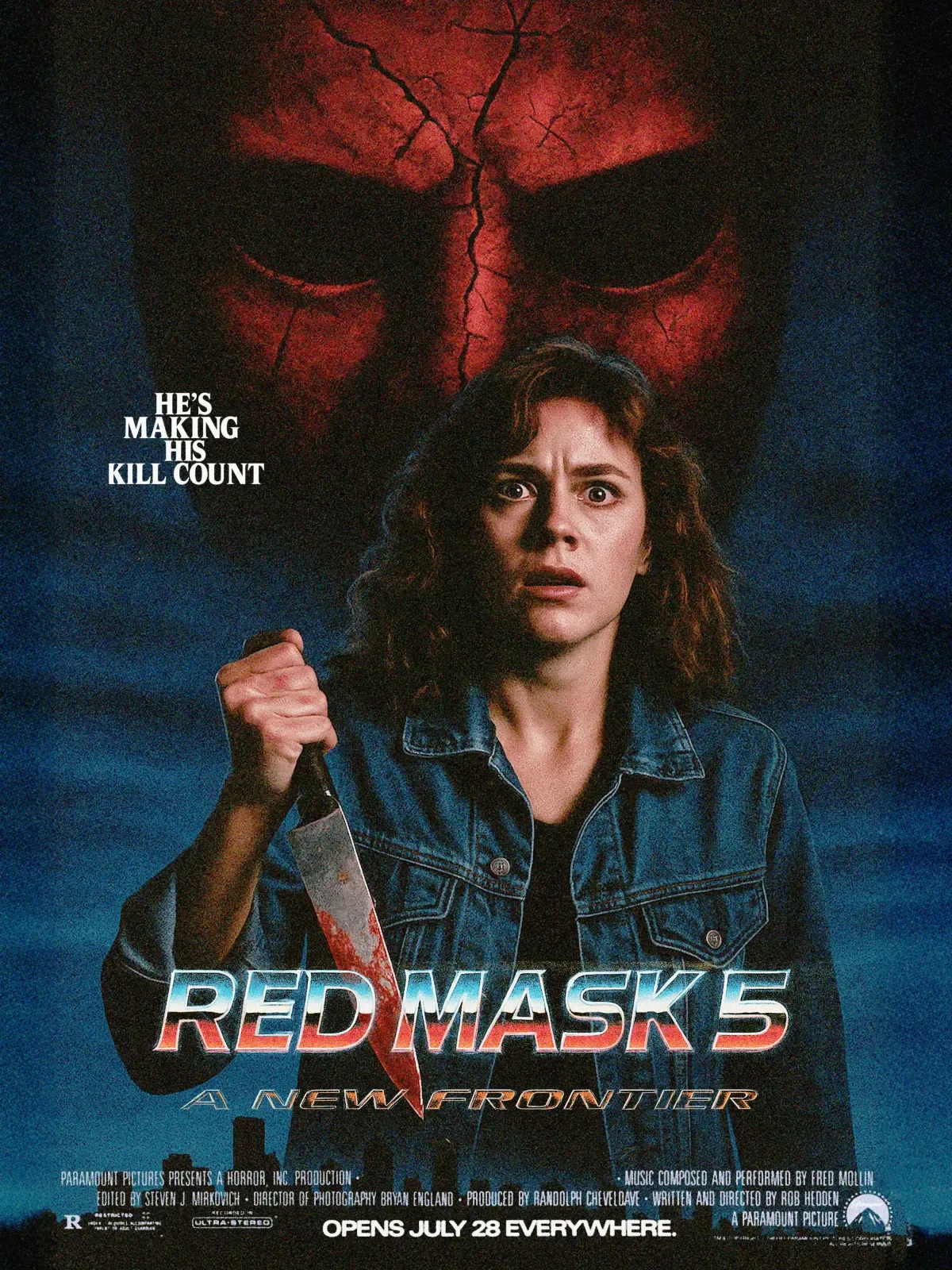
Red Mask 5: A New Frontier, 1989Art: Photographed, not painted: the heroine in a denim jacket with a bloody knife, a cracked mask filling the dusk sky, a city skyline at her feet.Type: A chrome title in sunset colors; a wide outlined subtitle; a stacked tagline in condensed serif capitals; “Opens July 28 everywhere.”Fine print: Paramount, home of the “Friday the 13th” sequels; Ultra-Stereo; an R box.Period: Vivid color and hard light. The franchise leaves the woods for the city, as Jason did that summer in “Jason Takes Manhattan.”Studied: “Pet Sematary,” “Puppet Master,” “Shocker,” “Society” and “Intruder.”
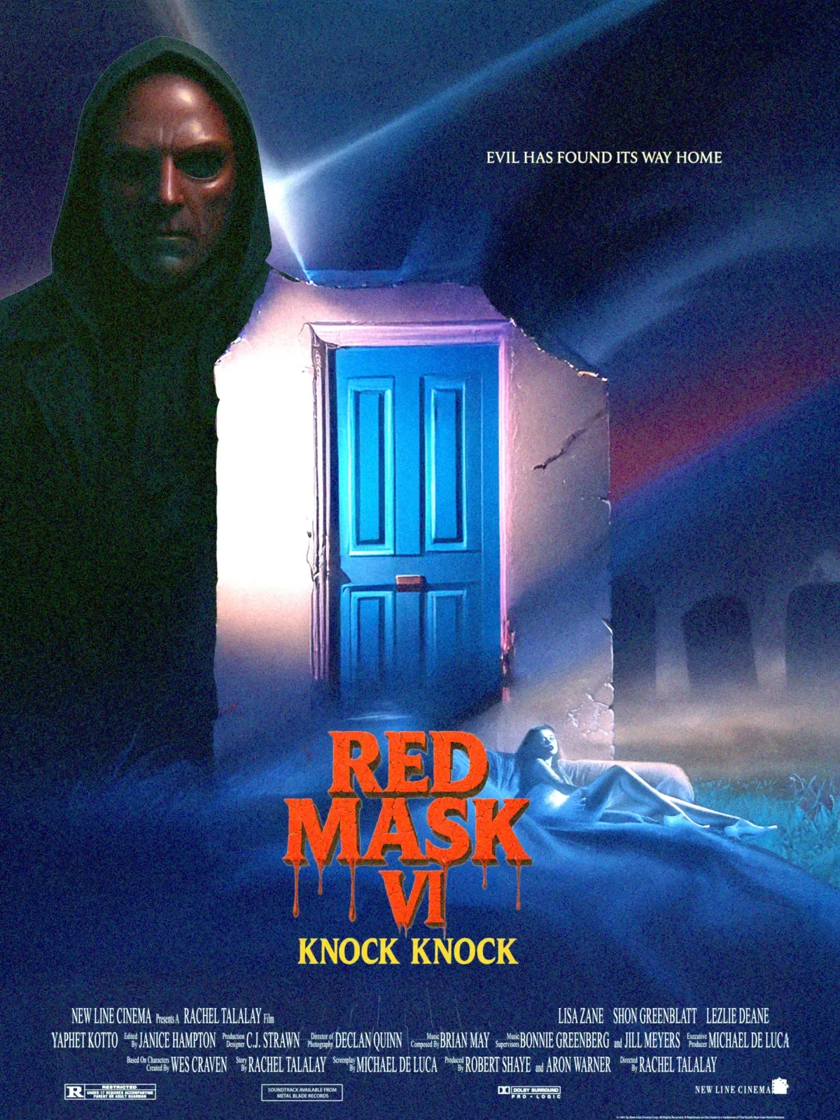
Red Mask VI: Knock Knock, 1991Art: An airbrushed photo composite in violet and electric blue: a glowing blue door in a broken wall, a woman asleep in a foggy graveyard, a beam of light cutting across.Type: The numeral “VI” in dripping orange-red serif; “Knock Knock” in yellow; billing in tall condensed type.Fine print: New Line Cinema, a soundtrack label, Dolby Surround and an R box.Period: Paint gives way to photography and psychological dread, the year of New Line’s “Freddy’s Dead” and “The Silence of the Lambs.”Studied: “The Silence of the Lambs,” “Child’s Play 3,” “The People Under the Stairs,” “Popcorn” and “Freddy’s Dead.”
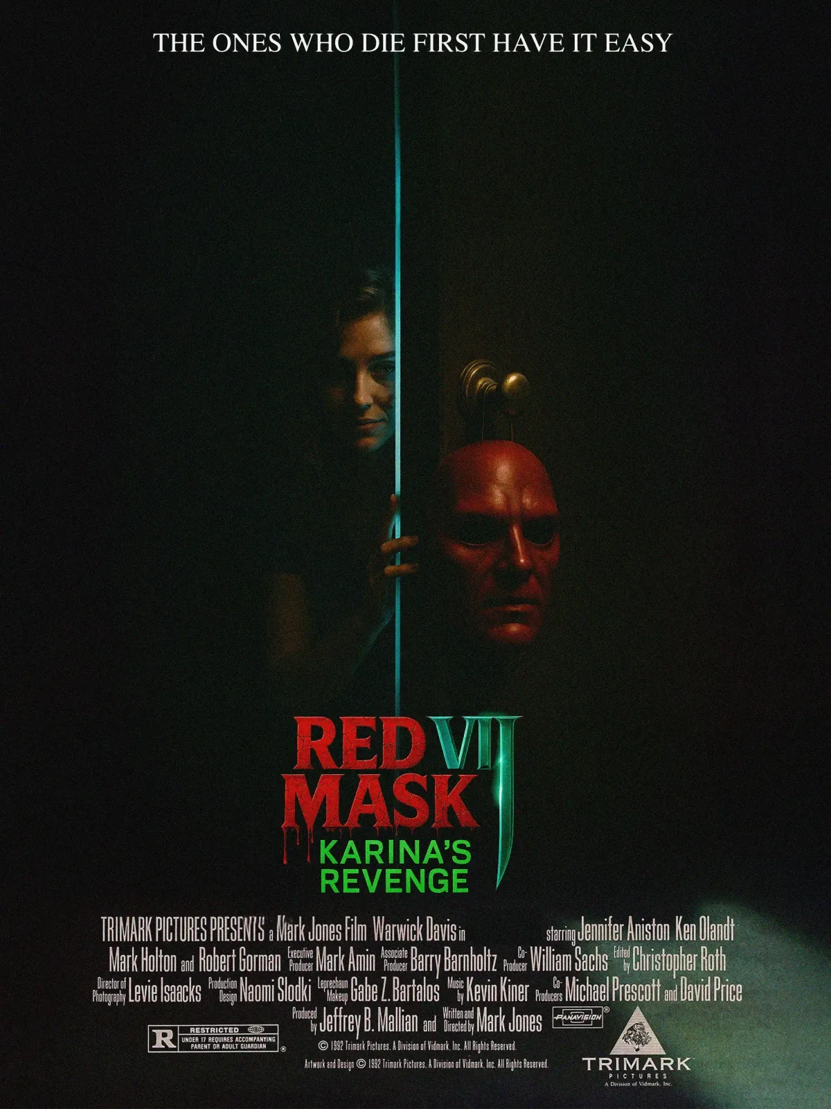
Red Mask VII: Karina’s Revenge, 1993Art: Nearly all black. A door cracked open on a single teal line of light, a woman smiling in the gap, the mask hung on the knob.Type: A distressed red title with blood drips, a tall metallic “VII,” the subtitle in bright green sans; the tagline in plain white serif capitals.Fine print: Trimark Pictures, Panavision and an R box.Period: The turn to minimal posters: one stark image and little else. Trimark released “Leprechaun” that year.Studied: “Leprechaun,” “Cronos,” “Jason Goes to Hell,” “Needful Things” and “Body Snatchers.”
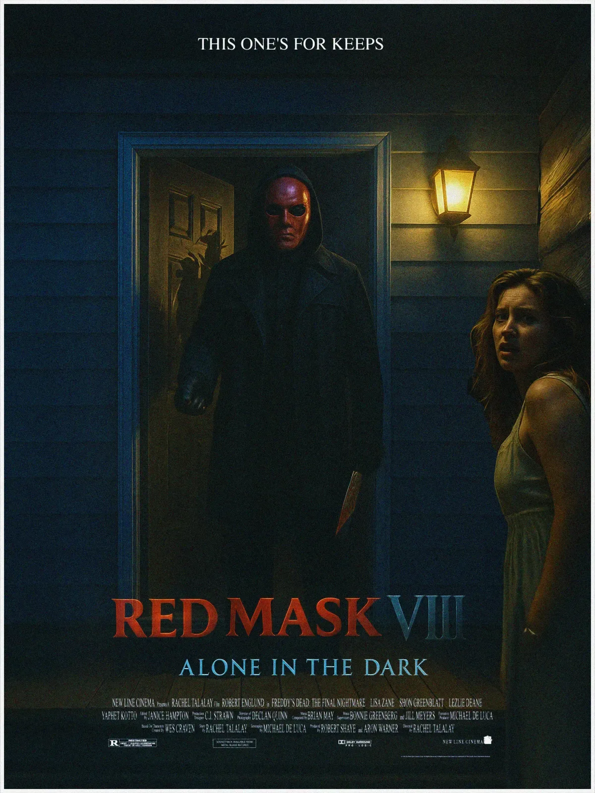
Red Mask VIII: Alone in the Dark, 1995Art: Photographed at night: the killer in a lit doorway with a knife, a woman in a white slip on the porch, one warm lamp against cold blue clapboard.Type: Classical Roman capitals in the Trajan style, red with a blue “VIII”; the subtitle in widely spaced blue capitals.Fine print: New Line Cinema, Dolby and an R box.Period: Darker and moodier, texture and restraint over gore, the year of “Se7en.”Studied: “Se7en,” “Village of the Damned,” “Candyman: Farewell to the Flesh,” “Species” and “Tales from the Crypt: Demon Knight.”
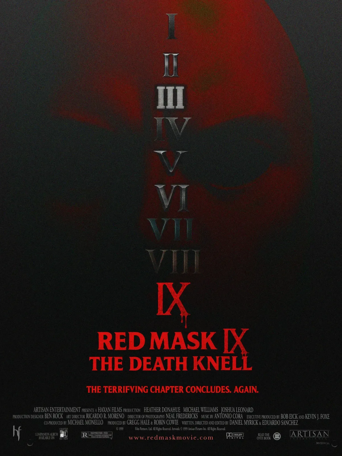
Red Mask IX: The Death Knell, 1999Art: Almost black, the mask a red shadow behind a column of numerals, I to IX, each in a different metal, the ninth in red.Type: Red serif capitals; the tagline jokes about final chapters: “The terrifying chapter concludes. Again.”Fine print: Artisan Entertainment and Haxan Films, the team behind “The Blair Witch Project”; a website; a companion album; a tie-in paperback; Dolby Digital.Period: Minimal and realistic, the year a horror film sold itself online.Studied: “The Blair Witch Project,” “The Sixth Sense,” “Sleepy Hollow,” “Audition” and “House on Haunted Hill.”
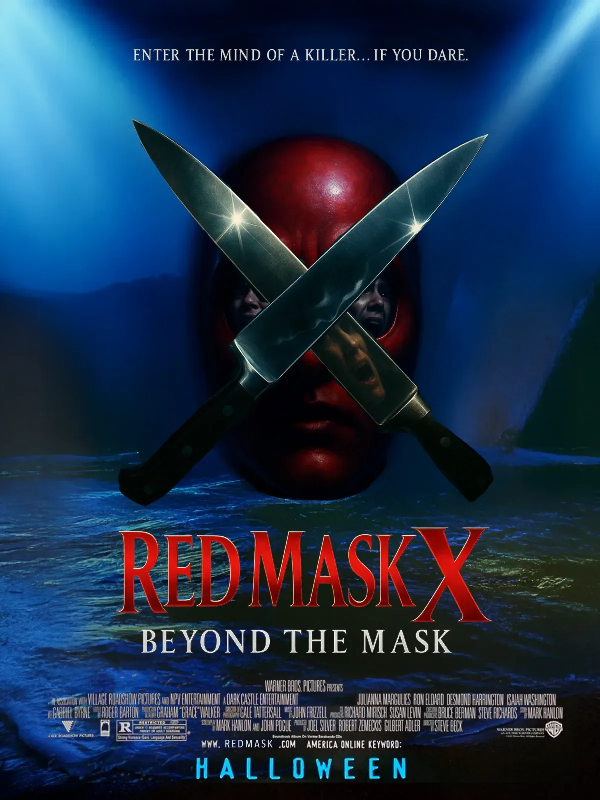
Red Mask X: Beyond the Mask, 2001Art: A glossy digital composite: the mask behind two crossed chef’s knives, faces reflected in the blades, cold blue spotlights over dark water.Type: A beveled red serif title with a large “X”; the subtitle in silver serif; a spaced serif tagline.Fine print: Warner Bros. and Dark Castle, the label behind “House on Haunted Hill” and “Thirteen Ghosts”; an R box with its reasons; a soundtrack on Varèse Sarabande; a .com address and an AOL Keyword.Period: Realistic, eerie and cold. AOL Keywords ran on studio posters at the turn of the century.Studied: “Jeepers Creepers,” “The Others,” “Thirteen Ghosts,” “Session 9” and “Hannibal.”
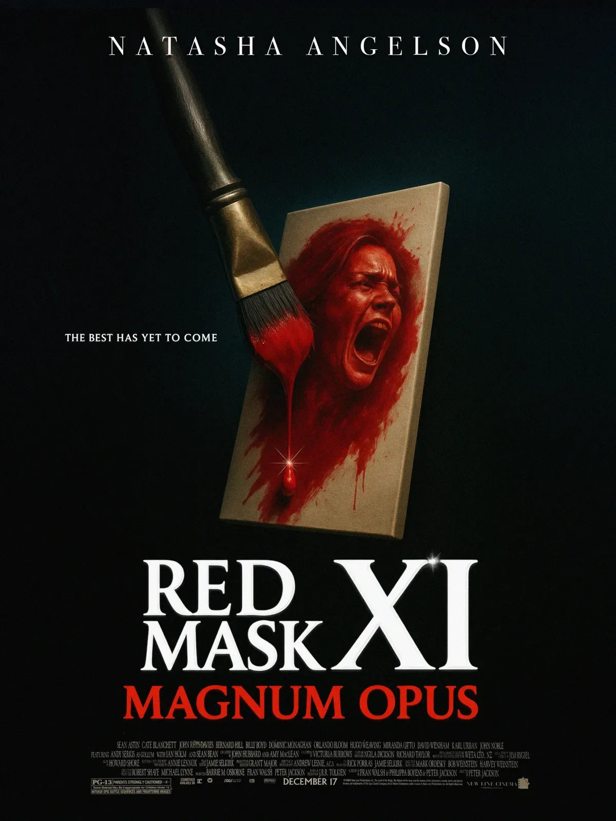
Red Mask XI: Magnum Opus, 2003Art: One object on black: a brush painting a screaming face in blood red on a small canvas, the paint dripping off the edge.Type: The star’s name spread wide across the top; a white serif title with a large “XI”; the subtitle in red serif capitals; a release date, December 17.Fine print: New Line Cinema; SDDS, Dolby and DTS marks; a PG-13 box with its reasons.Period: Extreme close-ups and visceral imagery, with a PG-13 rating like “Darkness Falls” that year.Studied: “Freddy vs. Jason,” “House of 1000 Corpses,” “Wrong Turn,” “Darkness Falls” and “High Tension.”
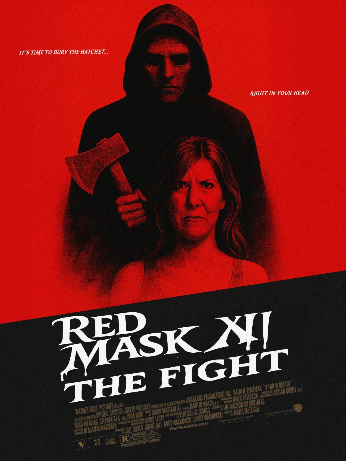
Red Mask XII: The Fight, 2005Art: Pen-and-ink hatching, red on red: the hooded killer raising a hatchet behind a grim woman; a black band cut on a diagonal below.Type: A white title in a flared display face with drips; the tagline split in two italic lines, “It’s time to bury the hatchet… right in your head.”Fine print: Warner Bros., a website and an R box.Period: Graphic, gritty and brutal, the year of “Saw II,” “Wolf Creek” and “The Devil’s Rejects.”Studied: “The Descent,” “Hostel,” “Wolf Creek,” “Saw II” and “The Devil’s Rejects.”
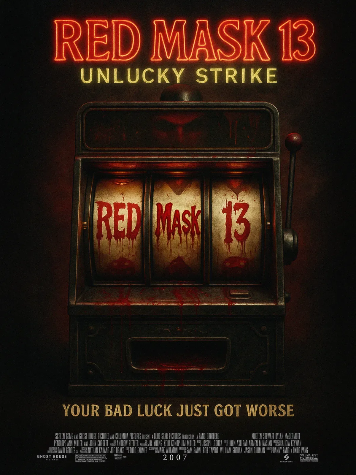
Red Mask 13: Unlucky Strike, 2007Art: Sepia and oxblood: an old slot machine, its reels stopped on Red, Mask, 13 in dripping letters, blood smeared down the cabinet.Type: The title as a red neon sign; the subtitle and tagline in tall gold capitals; the year, 2007, set alone in the credits.Fine print: Screen Gems, Ghost House Pictures and Columbia, the team behind “The Grudge” and “Boogeyman”; a PG-13 box.Period: One object, one idea, as supernatural horror came back.Studied: “Paranormal Activity,” “Trick ’r Treat,” “30 Days of Night,” “The Mist” and “REC.”